Data has become an integral part of our everyday lives. Data drives decision-making. We use it to measure everything from outcomes to performance to progress to trends to behaviors…and the list goes on.
But what value does data alone provide? Without context or structure and no story to tell - what do we have? In order to help paint an accurate picture, data visualization, and reporting can be the most effective route to take.
No one ever made a decision because of a number. They need a story. - Daniel Kahneman
In this post, we’ll share best practices for building reports and tips specific to creating custom reports in HubSpot.
Why are reports so important?
We can have all of the data in the world. But if we don’t understand how to organize and present that data in a clear and compelling way, how can it tell its story? With so many ways to structure a report and a seemingly endless amount of different data points, building a compelling report can quickly become daunting.
Imagine you’re in year 4 of launching a new SaaS startup. Until recently, business has been good and customers seemed happy, which is why you were so surprised by the Q1 summary report showing an increase in churn coupled with a decrease in new accounts.
You start digging into your data for answers.
- How many accounts failed to renew?
- How many were canceled in the first 90 days?
- Why aren’t we closing as many new accounts as the previous year?
You’ll need reports to find some answers.
Creating your report - let's break it down
What question are you trying to answer?
Defining the goal of your report enables you to clearly identify the data and metrics that are needed.
- How many accounts failed to renew?
- What percent of our revenue comes from new vs. existing business?
- Which marketing emails helped generate the most revenue in the last year?
Identify your reporting metrics
You’ve defined the goal of your report, but what are you measuring, and with which data points? We build reports to analyze and identify behaviors, business goals, and trends.
- Which data is relevant to the goal or initiative being measured?
- These could focus on website traffic, lead generation, or sales revenue
- You can also create custom metrics based on your goals
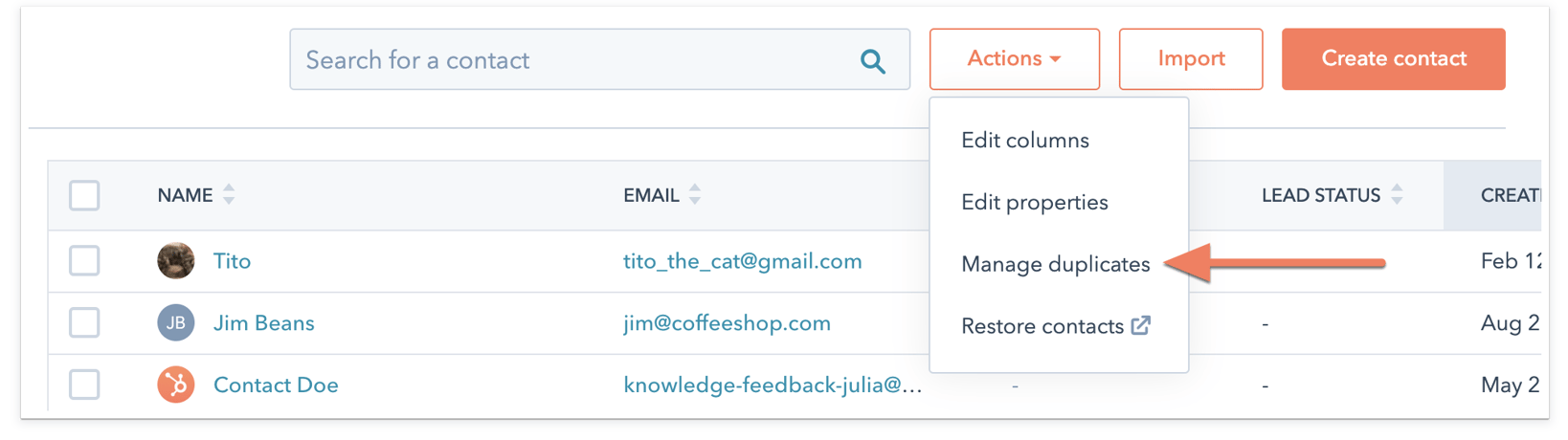
Check the quality of your HubSpot data
Reporting that relies on bad data can have immediate and costly consequences. For example, marketing campaigns or analysis based on faulty data means not reaching potential customers and missing out on conversions and lost revenue.
You don’t have to clean your entire HubSpot instance to build a single report, but it is important to check the quality of data for your key data points. At Process Pro, this is one of the first things we do.
Here’s a quick way to check your data:
- Draft 2-3 simple reports using key data points:
- Is the data complete or are a lot of records missing key values?
- Is the data consistent across records?
- Will you need to normalize any data before you can report on it?
- Does the data make sense/in line with what you expected?
Cleanse and Normalize your Data
If your data looks good, you can skip this step!
If not, HubSpot provides several great out-of-the-box tools for cleansing your data.
Check Out HubSpot Analytics Reports
HubSpot provides a whole suite of out-of-the-box analytics reports that you can quickly customize for your needs. See if one of these solutions fits your needs before jumping to build a custom report.
- Sales Analytics
- Track activities to coach your reps
- Monitor deals to improve your pipelines
- Traffic Analytics
- Track sources, pages, topics, and campaigns that are driving traffic to your website
- Contact Analytics
- See more info on your contact, like country, lifecycle stages, and how they found your website
- Revenue Analytics
- Track your recurring revenue, upgrades, downgrades, and churn
- Custom Behavioral Events
- Create custom events to track any activity done by visitors on your website or app
- Personalize your marketing based on their actions
- Track performance of events over time
- Campaign Analytics
- See how your marketing efforts are impacting your business
- Track performance over time
- Sales Content Analytics
- See how your sequences, templates, and documents are being shared and viewed
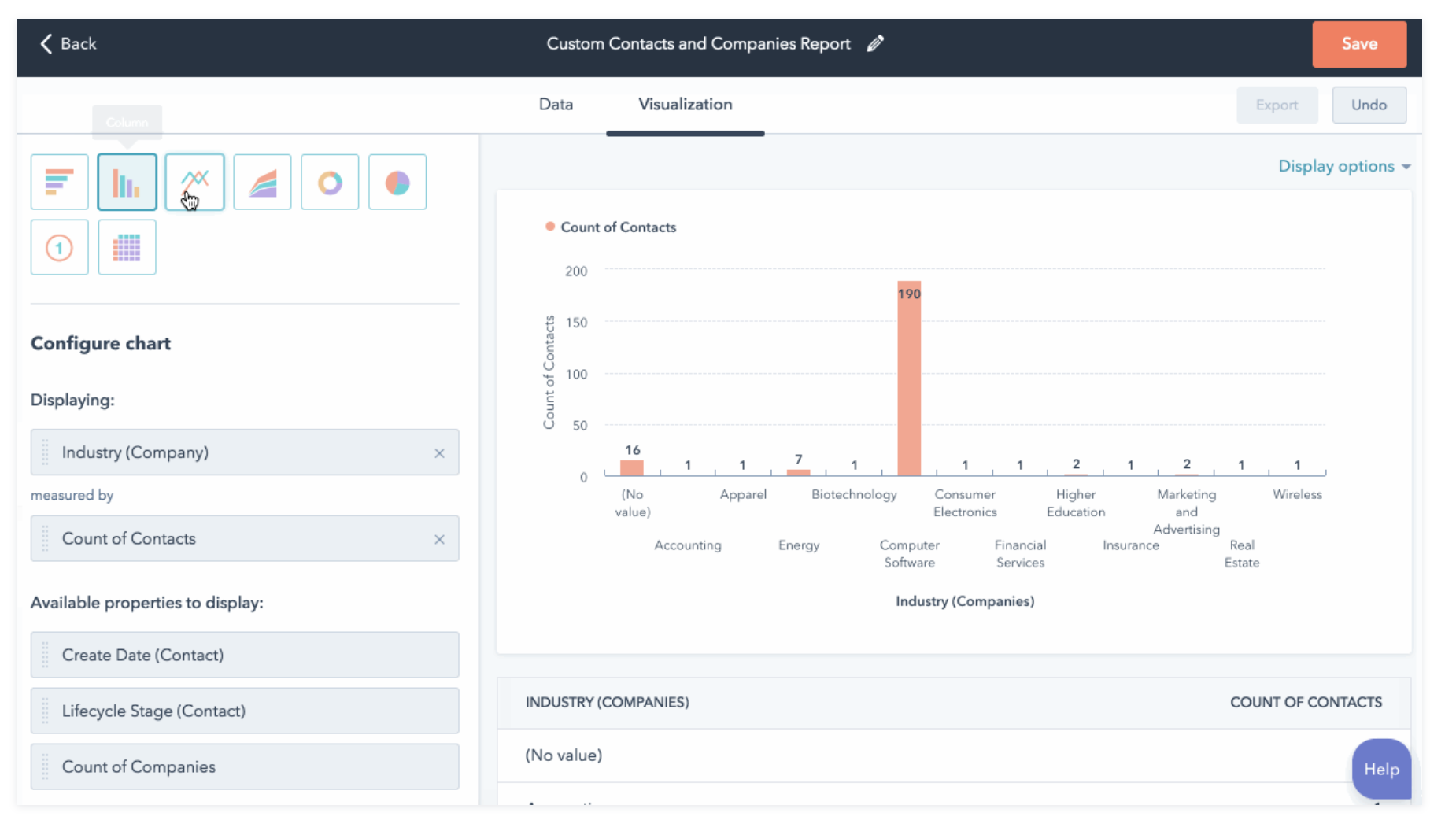
Build Your Custom Report
You've already outlined your data sources and data points. Now it's time to design your report.
- How do you need to filter your data?
- What time frame should be included?
- If you're analyzing revenue, are you looking at both new and existing business or only one of those metrics?
- How should the data be presented in the report?
- The X-axis runs horizontally and usually measures the output of something that has already happened
- Total sales last month
- Number of new customers
- Average days to close
- Number of deals won or lost
- The Y-axis measures inputs based on your count/timeframe
- Calls made
- Emails sent
- Conversations
- Meetings scheduled
- Consider the use of color to draw attention and accentuate key measurements
- Which report type should you use?
- Data tables - use when you want to be able to easily compare multiple metrics across several assets
- Pivot tables - bar and column charts, which are great for breaking down data into groups for easy comparison
- Line graphs - these are intended to show information that changes over time and for tracking incremental changes in data
- Area graphs - these reveal trends over time
- Pie charts - great for showing how different categories make up parts of a whole; use this to show numbers in percentages; show the distribution across selected categories to equal 100%
- Donut charts - these are like pie charts without the middle section
Conclusion
Now that you've got the tools to tell the best stories with your data, go give it a test run!
Just remember to:
- Use clean data
- Know the question you’re trying to answer
- Identify the data points and metrics for your report
- Consider which report colors and chart work best for what the report is trying to convey

.png?width=767&name=image%2032%20(12).png)